The Call-to-Action ("CTA") component is a key element on a webpage, acting as a signpost that lets the user know what to do next. Without a clear CTA, the user may not know the next steps to take and is likely to leave the site without accomplishing their task.
Website Style Guide
This guide is to keep all Content Editors in sync with styles and expectations surrounding website page creation. This documentation transforms design and code bases into a well-organized library. Style guides aid in promoting clean and consistent user interfaces on the website.
Component
Call to Action

Component
Column Row
The Column Row component allows for users to include information in a logical, scannable, format. Use the Column Row component when you need to display content side-by-side in three or four columns.

Component
Showcase
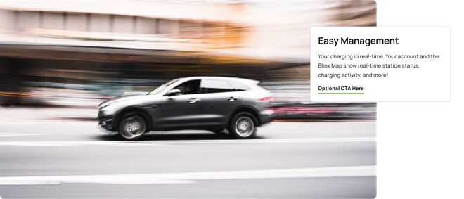
The Billboard component is similar to the Hero component. It gives you the chance to break up the text on your page, highlight a piece of information with an image, and provide a (optional) link.
Component
Logo Row
The Logo Row component showcases Logos of partners in an easy to see format.

Component
Full Width Image
The Full Width Image component allows for a visual break in heavy content pages. Often used for images but can additionally be used to include graphs or other visual information.

Component
Quote Row
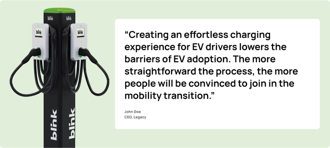
The Quote Row component allows for customer comments to be highlighted in a visually appealing style.
Component
Tabs
The Tabs component allows for related content to easily be seen by users. Tabs allow users to quickly switch between related sets of information without scrolling or navigating to another page.
